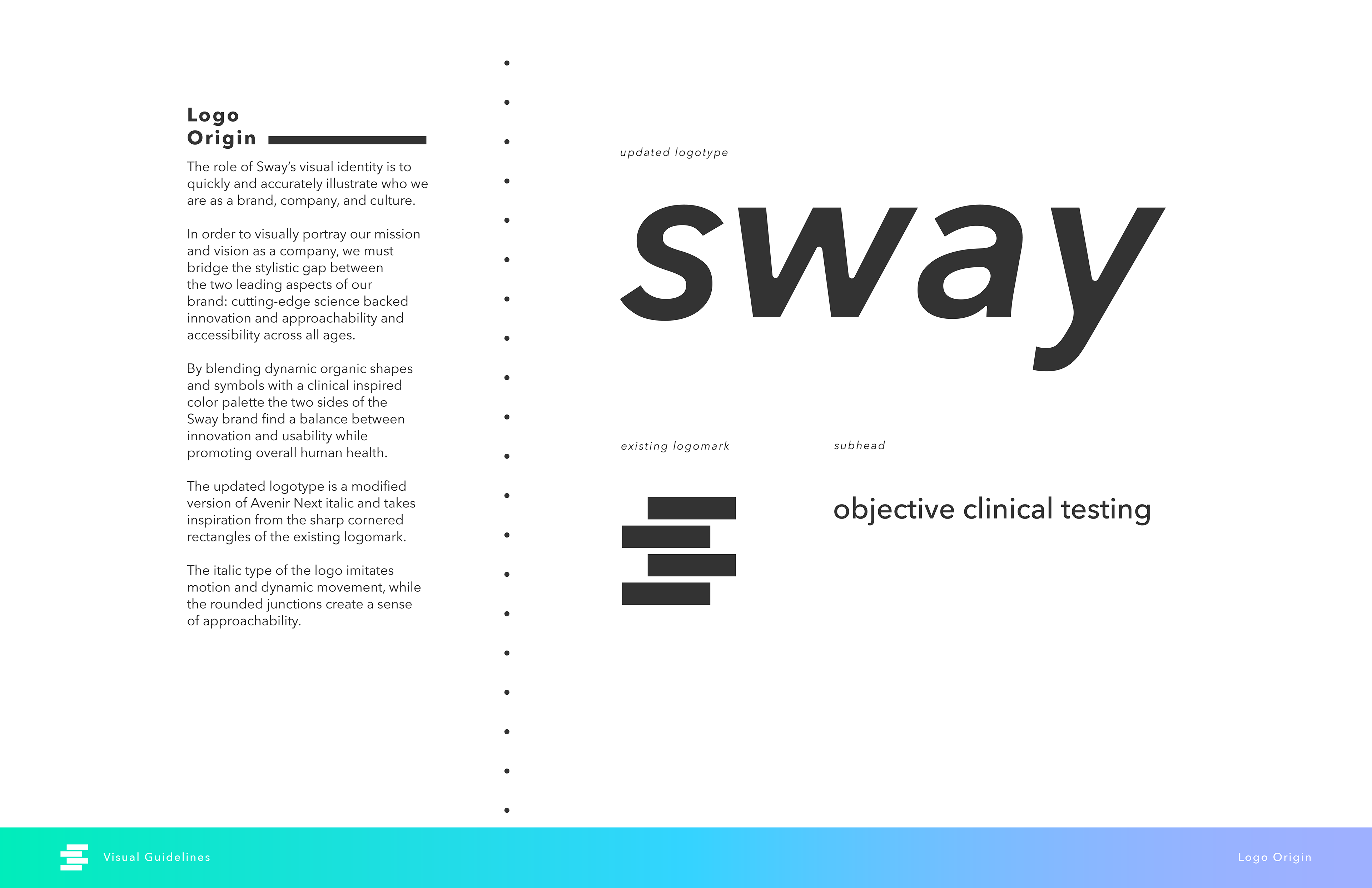
The role of Sway's visual identity is to quickly and accurately illustrate who they are as a brand, company, and culture.
In order to visually portray their mission and vision as a company, we must bridge the stylistic gap between the two leading aspects of the brand: cutting-edge, science-backed innovation and approachability and accessibility across all ages.
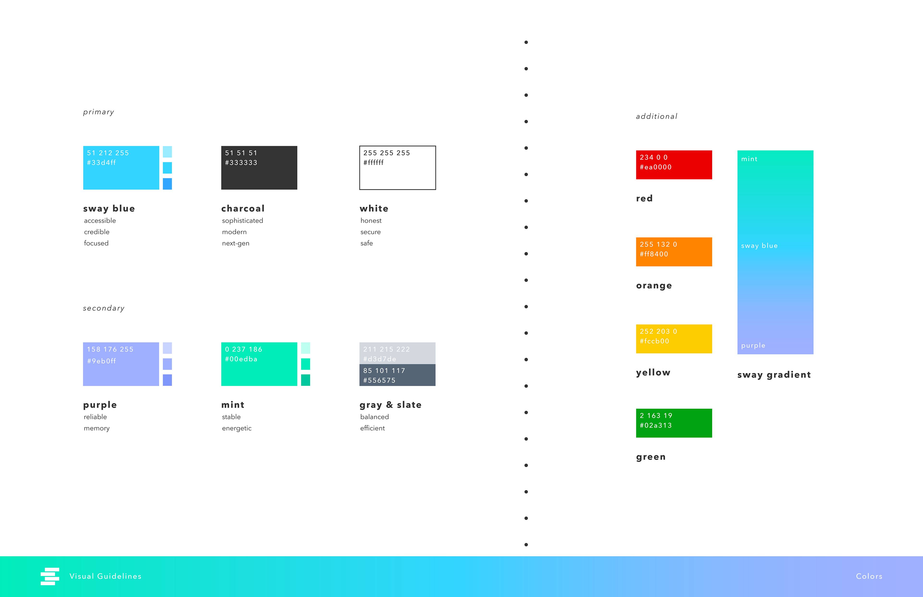
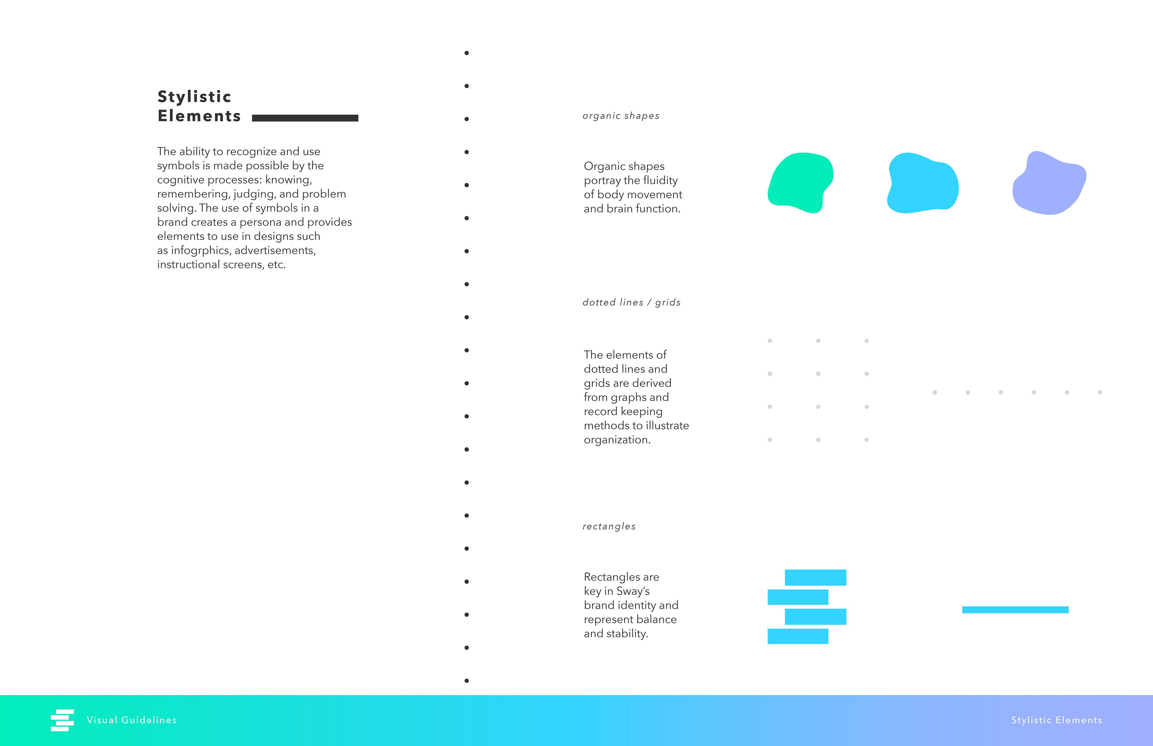
By blending dynamic shapes and symbols with a clinical inspired color palette , the two sides of the Sway brand find a balance between innovation and usability while promoting the mission of overall human health.
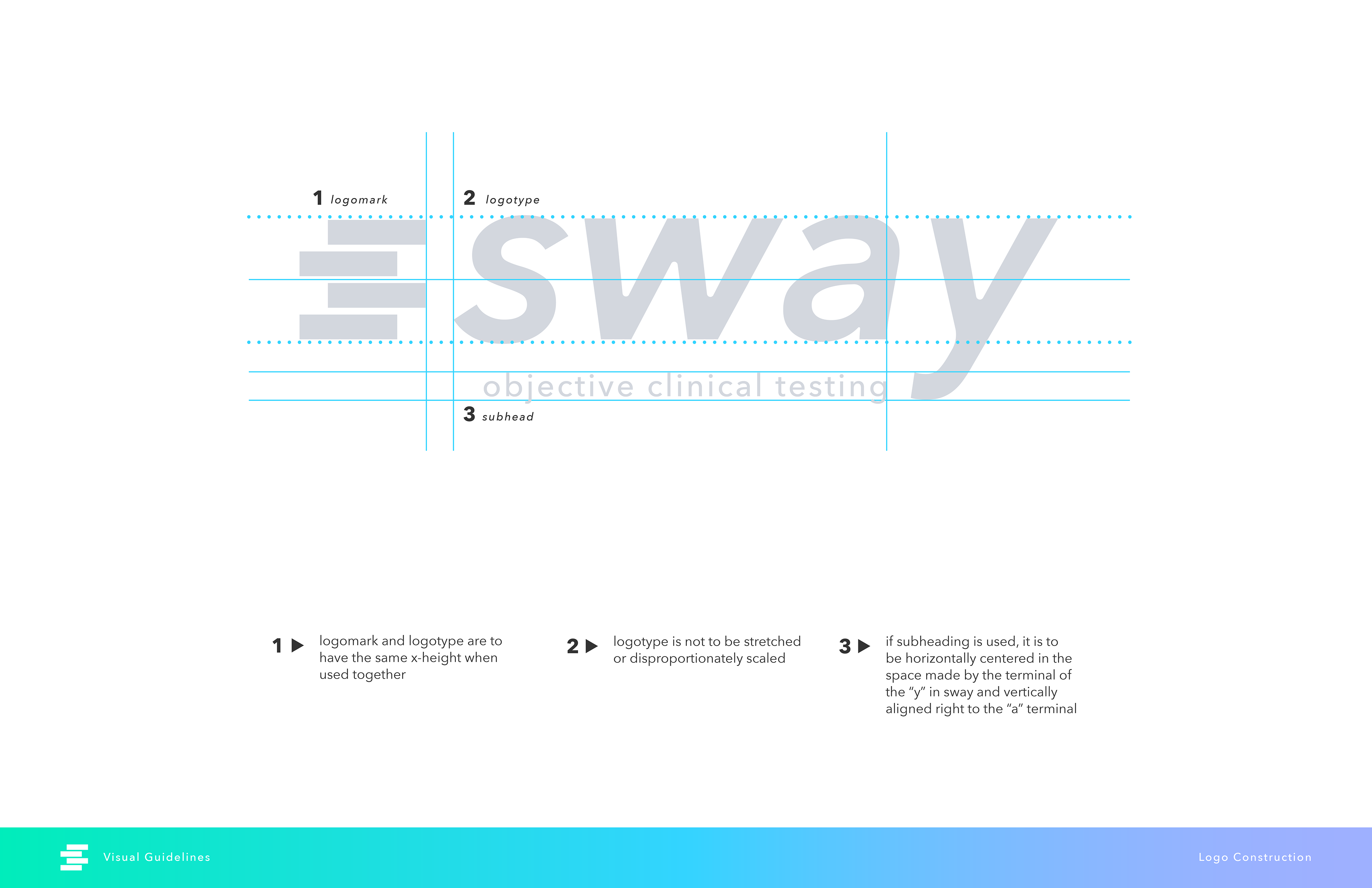
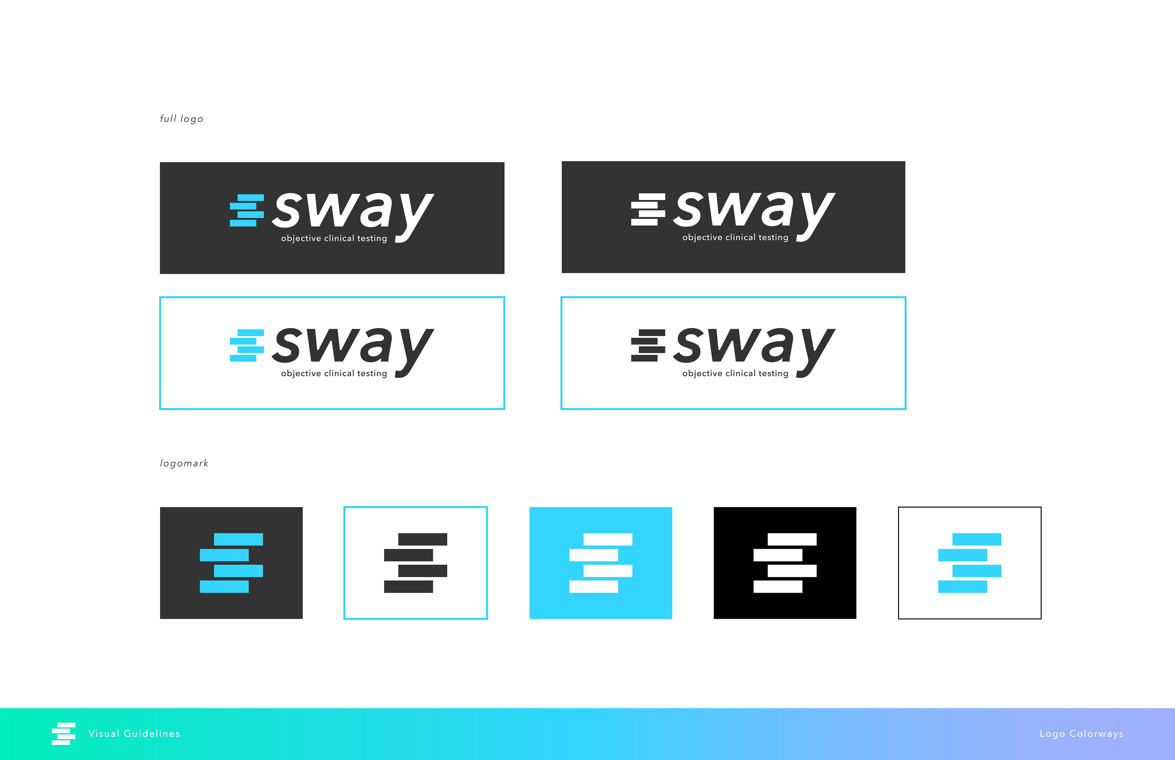
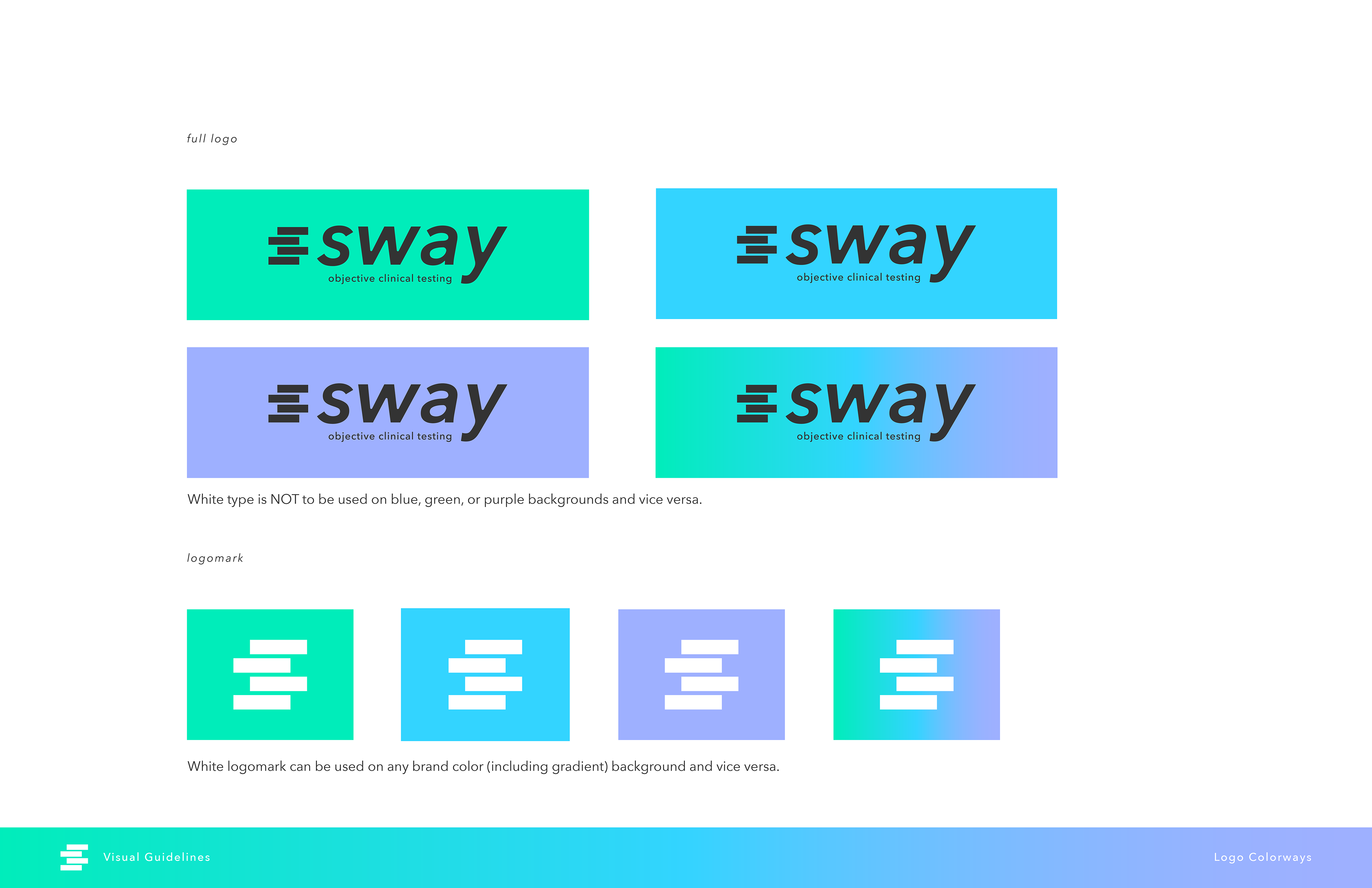
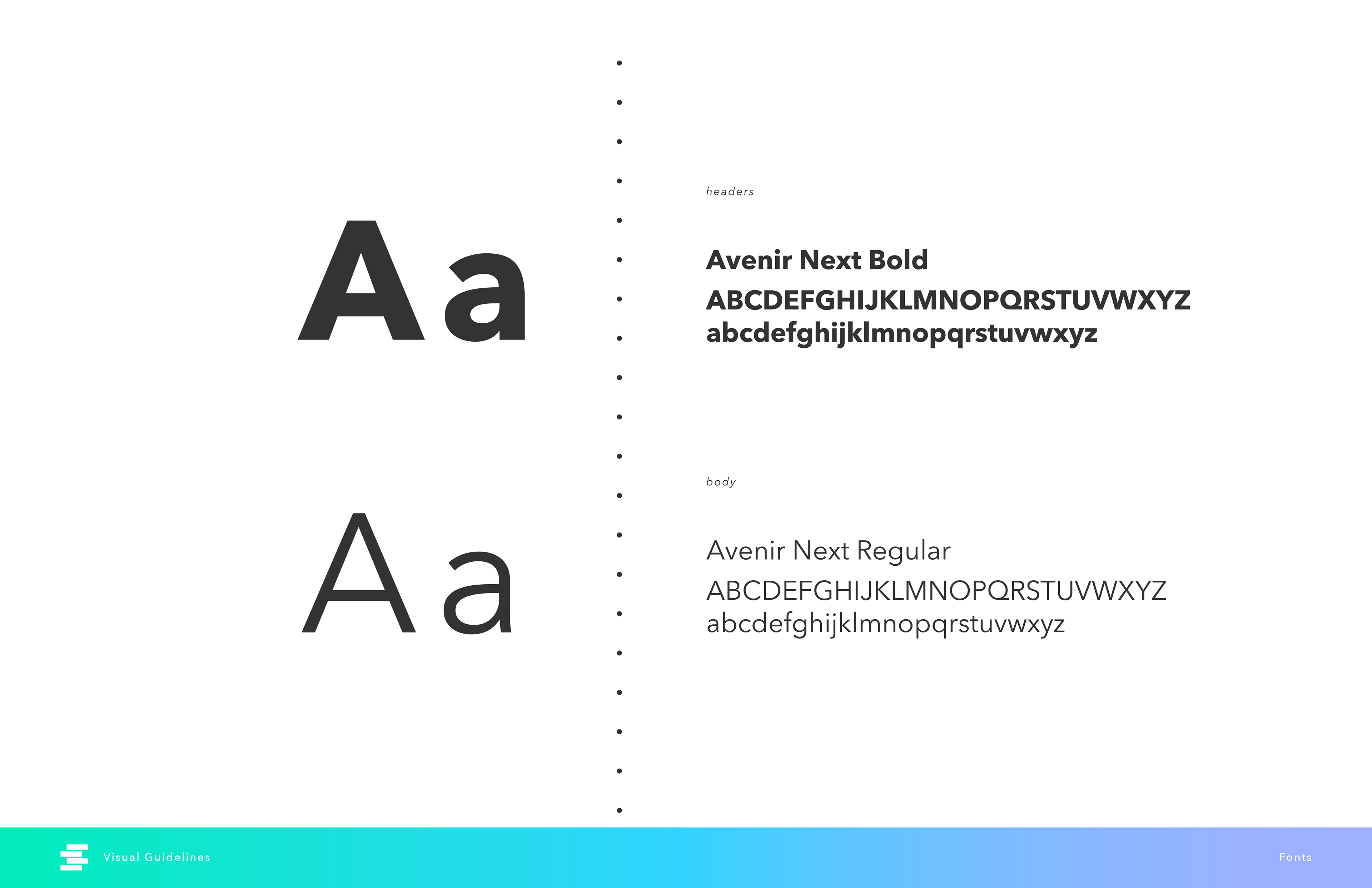
The updated logotype is a modified version of Avenir Next italic and takes inspiration from the sharp cornered rectangles of the existing logomark.
The italic typeface imitates motion and dynamic movement, while the rounded junctions create a sense of approachability.
Updated Brand Guidelines



Updated Banner Image

Updated Banner Image
Previous Branding:

Previous Logotype
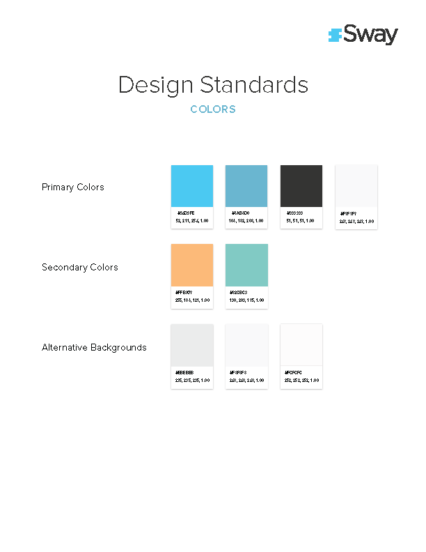
Previous Brand Colors

Previous Facebook Banner

